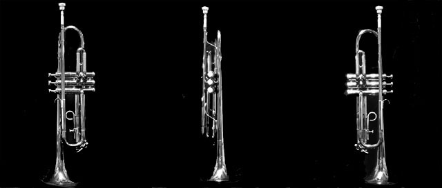
I think this might have worked better if you had three differing views of the trumpet, and they were a little less exposed, or you used softer lighting.
Great images, nice lighting and good clean black background.
Layout doesn't work well for me - I'd prefer much more space above and below the trumpets and much less space between them horizontally.





 Add photograph to your favorites
 Add photographer to your favorites


 Photographer found comment helpful.


