| Author | Thread |
Comments Made During the Challenge  |
|
|
07/05/2005 05:02:01 PM |
|
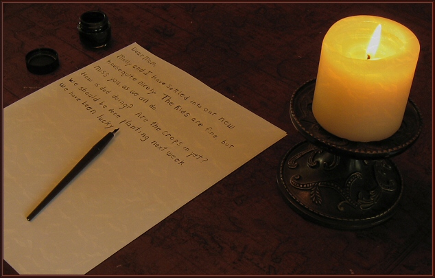
the idea is great, but the writing is wrong for the days of pens and ink - it should have been cursive, and with wider margins, and dated. thick candles like that probably only found in churches too - but I do like it otherwise! |
|
 Photographer found comment helpful. Photographer found comment helpful. |
|
|
07/04/2005 08:28:11 AM |
|
true meaning of obsolete in this image. |
|
|
|
07/03/2005 12:42:23 PM |
|
|
|
07/03/2005 06:01:22 AM |
|
fab, just love it. love the colours, the way it's set out and the meaning behind it <10> |
|
| Photographer found comment helpful. |
|
|
07/02/2005 04:21:08 PM |
|
I was considering doing such a shot, and presenting it as an old fahioned handwritten manuscpirt, which is how they did it even as recently as 1920.. Could't find the correct tools, though. The only thing I am not seeing is an ink well. If there is one, it is so dark that it doesn't complete the composition. If you used an oil or keresene lamp, there may have been better light. I'll give it a 7 . |
|
| Photographer found comment helpful. |
|
|
07/01/2005 12:05:00 AM |
|
I was reading your note....and thinking about the language they used back then. They usually used mother, father, children instead of mom, dad, and kids. Just being picky. Beside that, this is a very clever idea for this challenge and very well put together. Lighting is nice. Perhaps desaturating it a little would make it more antique looking. Good luck in the challenge. |
|
| Photographer found comment helpful. |
|
|
06/30/2005 05:12:32 PM |
|
awesome, but it would be even better if the letter was in cursive |
|
| Photographer found comment helpful. |
|
|
06/30/2005 01:49:08 AM |
|
Great concept, but I think the ink bottle should be in the foreground, as a lot of folks are not familiar with the technologu of the pen dipped in ink. Also, judging from what I've seen in family heirlooms and museums, people of that era often had beautiful handwriting. (I'd have printed it as well, though, because my handwriting is atrocious!) 7 |
|
| Photographer found comment helpful. |
|
|
06/29/2005 05:05:07 PM |
|
I like the diea.. but bad penmanship! |
|
| Photographer found comment helpful. |
|
|
06/29/2005 04:39:03 PM |
|
seems kinda boring and dull imo |
|
|
|
06/29/2005 07:53:56 AM |
|
I loved reading the letter....fits perfectly with the concept. |
|
| Photographer found comment helpful. |
|
|
06/29/2005 07:53:27 AM |
|
Nice concept. Image would have ben even better if you had used a nice script instead of printing like that. When you look at old letters, you'll see that people used flowing script, much better penmanship then what most of us are capable of these days. |
|
| Photographer found comment helpful. |
Theme:
Classic /
Light /
Dark
Home -
Challenges -
Community -
League -
Photos -
Cameras -
Lenses -
Learn -
Help -
Terms of Use -
Privacy -
Top ^
DPChallenge, and website content and design, Copyright © 2001-2026 Challenging Technologies, LLC.
All digital photo copyrights belong to the photographers and may not be used without permission.
Current Server Time: 10/15/2026 08:08:58 AM EDT.






 Add photograph to your favorites
 Add photographer to your favorites


