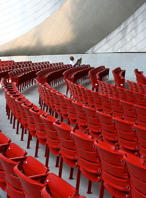
I took a lot of shots of this gentleman, and I don't think he noticed me. He sat there for quite a while, just contentedly reading his Sunday paper.
Focal length: 40mm
Used a circular polarizer to reduce glare on seats and on metal structure in the background.
Post processing: neat image, rotate, crop, increase saturation, clone out a few splotches on the wall, dodge highlights on man's head, resize, unsharp mask, save for web.
Statistics
Place: 7 out of 275 Avg (all users): 6.8531 Avg (commenters): 8.0714 Avg (participants): 6.7424 Avg (non-participants): 6.9823 Views since voting: 3196 Views during voting: 363 Votes: 245 Comments: 32 Favorites: 3 (view)
Loved this one when I saw it in voting week! You seem to be on a roll this week, one ribbon and one top ten :) Excellent shot, and perfect for the challenge..congratulations!
Back for comments... This is amazing on so many levels. Great lines all the way around, Love the splash of red and a wonderful subject and composition. 9
Excellent leading line concept. The upper part of the picture is distracting to the theme. I would have like to see it cropped out just above the subjects head.
I like this as an abstract, with all the great colored red seats and the superb composition leading to the titled subject. The subject is a bit small for my liking and, being the subject, the man and the paper might have occupied more of the frame with less of the chairs. But the set up is great and I like the Gehryesque wall in the background which could have been straightened with a perspective or distortion tool with out losing the flow. Nice use of the thirds as well. Overall, I really like this a lot!
Pritzker Pavilion! What a concept! The person tells the story and gives scale. I am biased to this so I am rating it high (and you will know what I mean when you look at my recent entries).
I think that the sharpness is great, as is the colour - simple and effective. I like the way that the lines of chairs as well as the lines in the panelling both lead to the reader. I wish I had an eye for composition as good as this.
I really like this. Lines everywhere. Great composition. I like the dominating color. The only thing that i think would be better is if the focus was on the person reading the newspaper. At least I would have liked to see it that way to make the comparison. Good luck....9
This shot rocks! I would love to see the guy moved a bit closer for better detail and a bit off center. The color of this is great. The back wall looks crooked, if you could straighten that, this shot would be great. Very photojournalistic.
Despite these little differences in technical opinion, you have succeeded in forcing me to have an emotive response to your image, and it quite obviously fits within the confines on the challenge. SUCCESS!!!





 Add photograph to your favorites
 Add photographer to your favorites

 Photographer found comment helpful.


