Overall, probably the best US commestible (along with habañero Tabasco). Nice, graphically cheerfull presentation. perhaps the black frames are a little heavy. 9
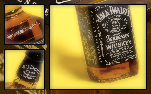
Another great advertisement. Quality of the pictures is great, particularly like the top left one. What i really appreciate, too, is the border. Its pattern comes from part of the label! Wonder whether you used pattern maker for that (and at a detail level of 15) or whether you did some cut and paste and 'transform-scale' for it. Well done, 10 Journey
Love the over effect/look of this shot... or maybe I just like the JD, not sure. :D Great work! The only improvement would be to crop the left of the main pic and increase it's height a little, and then grow the left pics to match the new height.
Looks like an ad. Very nicely done. I really like the background/border as well. The shots are really great, and the softness works excelently with this setup. Excelent clarity. If this doesn't place, it will be very close! The yellow really brings this out. You have something great here. Good luck in the challenge. 10
My favorite for the challenge. Thi is very well done.... good photography, nice work putting it together! Love the background that is still the bottle, good balance and color work... overall a very well done triptych. -10-
This is a REALLY nice triptych. It is well put together and framed nicely. I like the pattern of the background that the idividual photos are lying on. My only complaint is the yellow backgound behind the whiskey bottle. To me, it doesn't really seem to go well since it's such an extreme color in comparison to the earthtone hues of the whisky. It really fights for attention.





 Add photograph to your favorites
 Add photographer to your favorites


