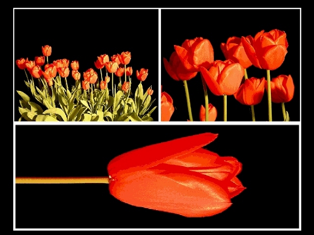
FIRST IMPRESSION: I like the many-to-one theme, lighting seems a bit off.
CHALLENGE: Meets the challenge.
COMPOSITION: The composition here is pretty good for each individual shot. I wonder if the top left shot might have been strengthened by including less negative space at the top. Also, a more consistent framing method might also add to the overall appeal of this composition.
TECHNICAL: The angle of your light is such that there is a lot of reflection off the tulips, and the reflection seems a bit yellowish to me. I wonder if a custom white-balance (or appropriate hue adjustments after the fact) would have yielded a more pleasing end result. In addition, the bottom shot in particular seems a bit oversharpened.
CONCLUSION: This is a good solid shot, and some additional work on the above-mentioned details might have put it quite a bit higher in the scoring.
Thanks for sharing and good luck in future challenges!
Closer and closer and closer work well here. the images seem slightly over exposed or over processed or something, especially the upper left tulips, which look like too much unsharp mask was used. Composition is wonderful, and the black background really sets off the colors.
Lovely subject matter. Nice concept for a tri. The small "group" view comes across a bit jagged (digital reality), the other two shots seem very good, but something in the red color seems unnatural (maybe a little too much post processing?). 7 Rob the Swash
Showy red extravaganza. i would try to be more carefull with the borders (too many different sizes, whites and blacks) For the sake of it, try with 1 pixel wide strips, I think it would gain in elegance
I like the images here and the different scales represented but am really not at all keen on the way the lower tulip is on it's side. That feels wrong to me.





 Add photograph to your favorites
 Add photographer to your favorites


