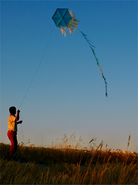
Often I feel that the inclusion of quite a lot of foreground is unnecessary, but here I feel that it really helps. The viewer gets the juxtaposition of the boy rooted on the ground and the kite flying in the air.
The foreground plants distract me a bit from the kid holding the kit. I like the idea of this very much but think that you might have composed it better with bit less foreground and the kid and kite over a bit more to the right and have more sky above the kite. It looks a little cramped to me. THe tail of the kite though is positioned pretty good so my suggestion might not have worked unless the wind blew a bit differently. All in all a good example of the challenge theme.






 Add photograph to your favorites
 Add photographer to your favorites


 Photographer found comment helpful.


