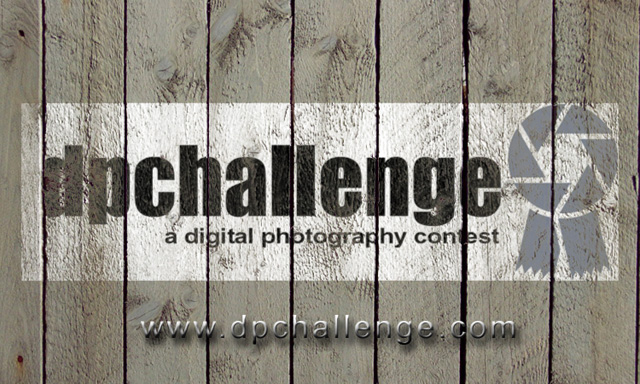
Great idea, however, I'd really lose some of the inner bevel on the URL. Also, tighten up (don't offset it by quite so much) and lighten the shadow underneath.
It's somewhat more unique than just a plain logo, but in fact it becomes less clearly visable than a plain logo, and the new texture doesn't really connect in any way with the site or make this a more appealing design. The beveled, drop shadowed url is a bit over processed I think. Plain black text would probably have been more effective.





 Add photograph to your favorites
 Add photographer to your favorites


 Photographer found comment helpful.


