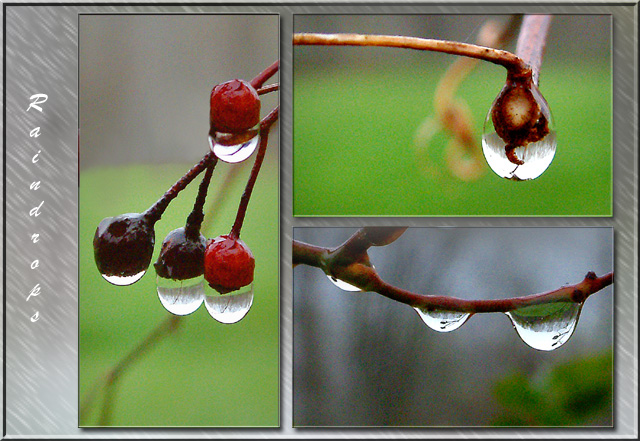
I think you did an excellent job with the layout and composition of this series. I particularly like water drop photos and each of these is nicely composed and exposed. I can't really suggest much for improvement on it. I would have possibly used a different color 'background' on the layout to help the images stand out a little more... maybe a dark blue or a darker grey....
Excellent shot. I love how the water magnifies the berries, also the reflections they give off. Didn't like the textured background too much (the gray). Great work none-the-less.
nicely done. looks quite professional - like those cheesy posters HR might hang around an office with some inspiring saying underneath the photo (like 'nature's beauty can be a fragile as a drop of rain lingering on the edge of a twig') - which is i guess my way of saying 'good job!'
The pictures are beautiful! Overall, I think the pictures would speak for themselves, that is, I\'m thinking the word and background take away from the impact of the composition. Maybe that\'s just me.
My first 10! This evokes feelings in me that are peaceful and relaxing. Your round shapes are well used! Even the roundness o fthe twigs help. Aaaaahhhh!
Good focus in all three. You have put them together very well. I don´t think it´s a good idea to use italian textstyle when you write vertically. But that is just a small detail. I like your picture very much and it´s one of my favourites this week. Well done and good luck!





 Add photograph to your favorites
 Add photographer to your favorites


