Author Thread Comments Made During the Challenge
Post actions
I uploaded thw wrong one too! DOH!
Post actions
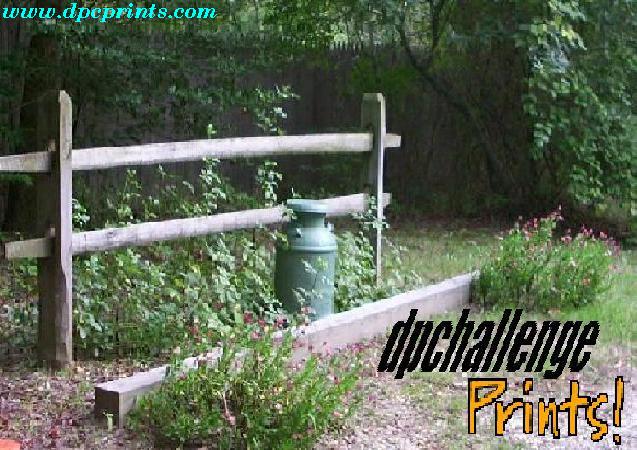
the photo you used is nice and very pretty but your letters seem to be in need of a little TLC to make them work better.
Post actions
Very poor picture quality. Liked the idea though.
Post actions
Low resolution has hurt type quality a bit, but I like the layout OK. And you did use a photo...
Post actions
Overall, good idea. But, this looks like a print from a dot-matrix printer.
Post actions
It looks distorted. Did you enlarge the file? Nice cocept though
Post actions
Is the pixelation on purpose?
Post actions
Too pixelated. Not a titillating choice of photograph.
Post actions
I can see some really heavey artifacts on this image, which really detracts.
Post actions
Photo to low res. If they sold prints like this i don`t think they would make much money.
Post actions
Dimensions are not 5x3. Also, this does not tell the viewer what DPC prints is.
Post actions
The text is blurry.... probably because you tried to stretch it too much. Should try to resize the text items to the approx size of your pic and then copy it in as a layer. Thumbs up for trying however!





 Add photograph to your favorites
 Add photographer to your favorites


