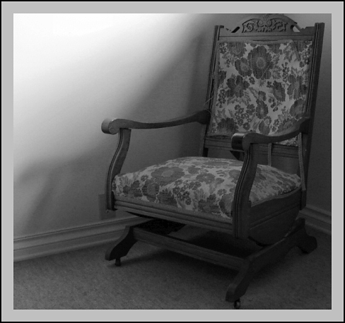
An old, broken rocking chair which no longer rocks the way it used to - it can barely support anyone's weight anymore.
For the photo, I used crop, resize, auto colour balance, auto contrast, clarify, auto saturation, unsharp mask, convert to black and white, and added the border.
Thank you.
Statistics
Place: 339 out of 453 Avg (all users): 4.5326 Avg (commenters): 4.6250 Avg (participants): 4.3311 Avg (non-participants): 4.7656 Views since voting: 2649 Views during voting: 328 Votes: 276 Comments: 10 Favorites: 0
nice idea. I struggle a bit with the light though: the wall is very present and therefore the chair lacks a bit of contrast and the bottom right part gets a bit dark.
very nice and simplistic..and it is old..but it is lacking something, something to help it from being over the line and into being boring (maybe a wider composition with a simple socket, bottom of a window, or part of a lamp in the corner showing, etc.)
I like the single chair in the corner. The lighting is a little lacking - maybe have more directly on the cushions. Could use some more contrast but maybe that's just me.




 Add photograph to your favorites
 Add photographer to your favorites


