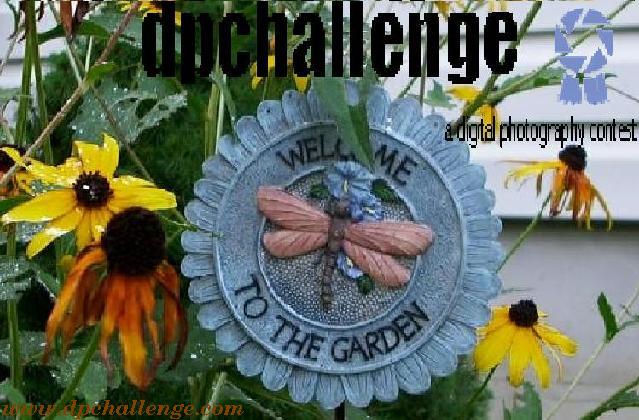
It's a nice sticker, but the resolution is not good (too many jagged edges). I think that it portrays a "gardening" bias, which is not what dpchallenge is about.
Much much too cluttered. I can't read the text I need to read - the website name and what the site is about - but I can read the message that welcomes me to the garden. The resolution is also just too low and the pixelisation is severe.
Apologies, but it's only a 2 from me.
Kind Regards
Kavey






 Add photograph to your favorites
 Add photographer to your favorites


