Nice copy work but, for staged shots I think the lighting should be fantastic. A lower placed highlight might have made this more compelling. Excellent composition.
Fantastic image. Would have worked well in Macro V or Circles, too. I like the colors and contrast most of all. You almost lost me with the foreground DOF but it's okay. The composition including the circles and the strong triangle element is very powerful. This is among my top picks. I hope it ribbons.
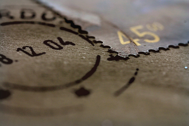
Woh... really nice macro view... I guess it's a stamp... Well focus, we can see the " focus line" very clearly, unless it's a photoshop effect ... hehe. 8
The closeness of this image makes the stamp look like a cerated piece of metal. Interesting idea. The shallow DOF draws the eye directly to the corner of the stamp however the cancellation date draws the eye away so is a bit distracting. Also, the part of the image that is in focus is either too narrow or to far from the bottom of the image. I feel that there is too much out of focus in the bottom half of the image. A slightly different perspective may have helped with the placement of the DOF. 6
Wow! Now that is REALLY narrow depth of field! I might show more of the subject though, I had to really think about this for a moment before I got it....






 Add photograph to your favorites
 Add photographer to your favorites


 Photographer found comment helpful.


