Author Thread
Post actions
This should have placed higher, but still in the top 50 isn't bad, considering all of the entries. Congrats!
Comments Made During the Challenge
Post actions
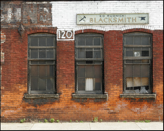
I find the sidewalk at the bottom distracting. A closer crop would've worked better I think. Good idea, though.
Post actions
Post actions
Good idea ... I think the shot would have been more appealing if you cropped out the sidewalk and some of the nothingness on the left.
Post actions
Nice shot. Perfect interpretation of the scene. Try rotating it 0.68 degrees clockwise.
Post actions
Very nice photograph. I like the colors in this, its a really unique image. My only suggestion would be to rotate the image a slight tad, to make the horizon straight.
Post actions
Nice colours, the composition conveys the message very well, maybe would have cropped a little bit more out of the left side of the photo.
Post actions
The white foreground a bit distracting. Perhaps a crop of just the grass windows and signage would have been different?
Post actions
Post actions
I like this photo. I keep thinking that it would look better if the sidewalk were cropped and the coloring enhanced to bring out the reds and oranges. Nice job.
Post actions
Very fitting for the challenge. I like the colors. I may of cropped out the sidewalk. I
Post actions
Post actions
Cropping this image to just under the windows would help lead the eye up to the sign and make a more intentionally composed image. The detail is nice.
Post actions
Great job. I sure hope Mr. Rudnicki has another source of income, huh? I love photos like this.
Post actions
Blacksmith should have been in the centre. Blacksmith hates you.
Post actions
Nice one. Good composition. I like this one alot. 9





 Add photograph to your favorites
 Add photographer to your favorites

 Photographer found comment helpful.


