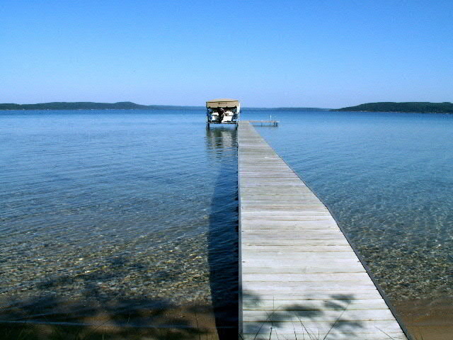
the shadows in the FG are distracting. If possible go 2-3 steps forward, into the water (nobody said that photography was a dry sport) and lower, for example to about the same height as the pier. Maybe also to the otherside of the pier to get rid of the shadow under it, but I don't know if the boathouse will be as prominent then. This is in most respects a good shot, but could be better. /7
nice idea. i like where you've placed the horizon, but the image looks a little unbalanced because the horizon is a little off level. it looks like you oriented the image to keep the left edge of the pier vertical, but i think the horizon is more important. I think the pier is allowed to be angled to offer the perspective, but when the horizon is off, it's just...well...off. Maybe a little tighter crop to let the pier flow off the left edge of the page would balance it a bit better.
nice technical aspects of the photo; sharp detail, lots of depth of field, and fabulous colour.
First of all, great image! I do, however, have a couple of suggestions as to how you may have improved the shot :)
Perhaps you could have positioned yourself to the left or right of the boardwalk. The composition is too centred for my taste and, I think, detracts from the overall impact of the image. If you composed the boardwalk stretching from either the bottom left or right diagonal to the middle, right or left vertical third. This would balance the shot nicely as opposed to leaving it centrally heavy as is the case now.
The other slight improvement I could possibly suggest is shooting this shot either at sunrise or sunset depending on whether you're facing east or west! This will not only bring out some nice warm colours but also eliminate some of those foreground shadows!
Concentration on the positive though, you've composed the image nicely horizontally, and the tones are fantastic! You've really captured the 'leading-lines' feeling nicely and the image sure is tack-sharp.
Great job on this image, I hope my comment helps if you ever decide to reshoot this subject, or a subject like it!
The shadows on the foreground are distractions, imho. Perhaps a crop off would have improved this image, as more contrast would have brought out the details more. 6
Leading lines or curves generally have two purposes. One is to lead the viewer into the scene. The other is to lead you toward the main subject. It is most effective if they come in from the lower left because that is the natural direction humans visually scan a picture from so are easiest to pick up.
You lines do a great job of pointing out to the viewer that this is a stark and very open lake.
good leading line. it's shadow is a bit distracting. i'm wondering if you could have improved the look and lessening of the shadow by centering the pier. the rule of thirds would still apply to the focus point. another possible adjustment to make it easier on the eye might be to lower your point of view so the end of the pier merges with the horizon
makes me realize i need a vacation, this looks great! Nice job of conveying a feeling of beauty and serenity in a well composed pleasant image well suited for the challenge






 Add photograph to your favorites
 Add photographer to your favorites


 Photographer found comment helpful.


