Hi TerryGee,
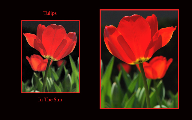
Beautiful photo, well lit and composed... nicely done. I think this would have been better as said below with a few different photos instead of just flipping one. Also the colors aren't the same for the two. To finish up the product I might have suggested the same size border around the entire thing in red. I just find the entire thing to be rather boring, and lacking any kind of a storyline... it doesn't really say much, except that you could flip the picture. Very nice colors, there's just something lacking for the entry. I also can't say that I care for the two different sizes... it just isn't attractive to my eye though I'm a very symmetrical person. The picture in itself though is very pretty, and well done.
I agree with the scores on this one. I think the photo i took is a good one, however I didn't have the time do do the rest of the project. This was done as a test to see if I could remember how to get more then one image on a background( I'm not good at that yet). I wound up not having anymore time, so I submitted the practice one.
All your comments are quite accurate, not enough story telling here. I did, by the way, have other tulip shots that I could have used along with this one.
Oh well, next time I will get my homework done sooner!
Nice color, beautifully taken images. It meets the challenge, but lacks a storyline, like maybe three tulips in various stages of oppening might have. I gave this one a 6.
I think this might have a higher visual impact on me had it been 2 seperate photos of the tulips. This is one photo, flipped. The photo is beautiful, excelent lighting and I love the black/green background on the tulips. The border fits wonderfully. Focus and clarity are good. Looks better on the right than left however. Overall nice. Good luck in the challenge.
the photos are very well done, i don't understand why you sized them differently, i think the . . . . oh, they are the same photo reversed. neat idea, but still i think the final product fell short of its potential.
Good idea, beautiful colours! The heavy red margins distract. Suggestion: make the pictures the same size, write "Tulips in the Sun" across the bottom (in a light colour, not in red), use a slight red margin either around the two pictures or around the whole composition.







 Add photograph to your favorites
 Add photographer to your favorites

 Photographer found comment helpful.


