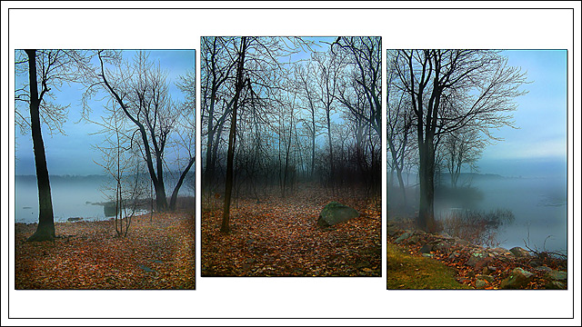
This photo is a composite of three different pictures taken at my mother's house. She has a view of the lake from several different places. This whole view does not actually exist, but I thought it made a neat landscape shot by piecing them together this way.
A little level and saturation adjustments in PS, some dodging and burning on the sky and leaves, some USM and Neatimage to clean up the sky. Resize and borders.
Statistics
Place: 7 out of 116 Avg (all users): 6.8261 Avg (commenters): 8.0667 Avg (participants): 6.7640 Avg (non-participants): 6.9388 Views since voting: 3310 Votes: 138 Comments: 19 Favorites: 6 (view)
This is my first critique, I just joined the Critique Club, and I am so glad your entry came up! The three pictures are beautiful, each could stand on its own, and I think that as a composition the three look even better than individually. Your final score in the challenge attests to this.
The colours of the pictures are very good. The blues and greys are just intense enough to reinforce the calm, foggy mood. The browns, oranges, blacks, and bit of green on the ground set off the blues just right. The silhouettes of trees and land complete the moody tone.
The composition meets the challenge without problem. I like the white background, any other colour would overwhelm. I like the staggered spacing, although I think that these tree pictures could be arranged in a number of different ways and look good together. I like it that the inside spaces (spaces between the pictures) are smaller than the space outside - it works very well here, and helps to pull the three together.
I find the drop-shadows on the individual photos a bit distracting. They look a bit more like a "blur" than like a shadow. You probably added them before resizing the pictures? One possibility would be to resize first, then add the shadows.
The black border line around the three pictures is also a bit distracting IMO, mainly because it lays further back than the pictures (because of the drop-shadows). On the one hand, it pulls the three photos together, on the other hand, it doesn't really add that much. One possibility might be to place the three on the simple white background, no black line, but push them up just a little (as a group), so that the top white space is smaller than the bottom white space - just an idea. I think one could play around for quite a while here.
The best part of this composition is that I can come back to it and look at it over and over, and still like it, still be drawn into it. Congratulations on a job well done!
Ursula I. Abresch
PS - Did you notice that placements number 7, 8, and 9 in this challenge were taken by Canadians?
Beautiful photos, and in this case I am glad that you did not try to go black and white. The color is so much more powerful. I like the misty look, and I like the overall effect of the lighting.
Very cool shot! I really like the fog hanging on the lake! The silhouetted trees are very nice. I'm liking this better and better....score upgrade from 9 to 10! Rob the Swash
There are many things I like about your composition. The staggered placement of the frames, the fog, and the wonderful colors of the ground. Funny though, it is spring here and this looks like an autumn or winter picture.
Very nice sceen, i woulld have suggested to overlaped (not neessarly leveled) the shots with a bit with tranparency and gotten wrid of the two external frames. You could then have shown more of your pictures sizewise. 7
Gorgeous pictures. I don't love the way you framed them though, they look like they are just floating in the white space. I'd rather have seen a more traditional composition.
Beautiful images - lovely capture of that misty and mysterious time of day. Personally not at all keen on layout with central image raised above others.






 Add photograph to your favorites
 Add photographer to your favorites


 Photographer found comment helpful.


