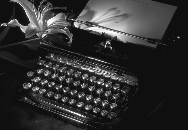
Thanks all for the comments. Regarding the lighting, I took this shot in a dark room and used a small flash light as the sole light source. Took several shots and realized it was very hard to see the R.I.P. on the paper. The flower was an after thought and I used it to cast a shadow on the paper in order to direct the eye to the RIP type and it added a little humor also. 1930s vintage typewriter my mother used.
The lilly adds a nice touch compared to the other typewriter shots. For a staged shot I think you could have used the highlight maybe an additional one on the lilly.
Really nice treatment of a somewhat common theme for this challenge. I do think it the image appears a bit OOF and that the lighting (while sparse) may seem a bit harsh = contrast too high). Still, a nice shot. 6
Good job on this photo. The lighting and composition is perfect. The flower and its shadow on the paper adds a nice touch. I was going to add that you should have used a bigger font on the RIP because you can hardly see it...LOL DUH. There's a little bit of glare on the space bar, but who cares...I like it. Fits the challenge subject perfectly. 10







 Add photograph to your favorites
 Add photographer to your favorites


 Photographer found comment helpful.


