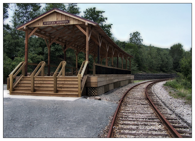
I really wish for two things here: first, that youy had squared the verticals up, it's all leaning right uncomfortably. Second, that you had burned in the lower left so it darkened as it neared the corner. That empty space is a negative in your composition. I understand why it has to be there, so you can have enough track, but work with it so it complements the subject. The leading line aspect is very nice, and the muted use of glow is quite attractive.
Your skyline looks like it was over "messed with" in Photoshop.....did you oversharpen? Maybe it's my monitor but checkout the skyline at the top of the trees and the bleed thru. It kinda glows. I like the balance of the rest of the photo.
Very nicely done. The composition is great and the colors are fantastic. I like the dreamy look. The only thing that bothers me is that you can tell you used the burn tool on the tops of the trees. However, it is one of my favorites for this challenge. 9





 Add photograph to your favorites
 Add photographer to your favorites

 Photographer found comment helpful.


