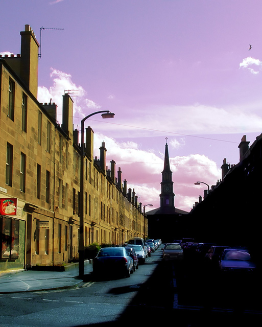
Top layer: separate colour tints painted on layer for street, shadow, buildings and sky....lended using 'overlay' at around 60%.
Middle layer: OptikVerve filter 'ambience' of background....all deleted except for street and shadow
Background layer on bottom
Statistics
Place: 121 out of 275 Avg (all users): 5.4855 Avg (commenters): 5.6364 Avg (participants): 5.3016 Avg (non-participants): 5.6870 Views since voting: 880 Views during voting: 302 Votes: 241 Comments: 12 Favorites: 0
great title. I'm not sure about the colors in the photo though. I'm assuming they're maniuplated (correct me if I'm wrong), but i don't think it's justified, the kind of thing i try when i'm trying to save a bad photo. but i think your photo is good enough to stand without a purple sky. but that's just one person's preference. 7
Scotland? Nice idea but I think there should be just a little shadow detail to balance the highlights. As this is an advanced challenge you can use dodging judiciously and it would lift this shot into a different league
i'm liking your composition. i would have gone with stronger contrast. possibly blackening everything on the right except the car in the middle. i realize you would lose the street line but i think it just competes with the shadow line anyway. now you have this light vs dark, good vs evil thing working with the church.
I like the composition very much. The leading lines are several, and meaningful. There is something about the processing that I feel detracts, however ... the colour of the sky and the harshness of the contrast (both of which I assume were intentional) rob the image of some of its potential impact. They get in the way, is what I mean. So does the bird. Still, it's a fine Leading Lines composition. 7






 Add photograph to your favorites
 Add photographer to your favorites


 Photographer found comment helpful.


