Hi there from the CC Club! :)
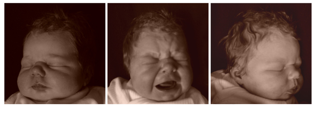
This image definitly tells a story .. so good job there :)
I do like the choice in tones and expressions of the baby .. the soft focus adds a nice touch to the whole feel of the image. the images i think could be a little brighter and i think the positioning should be switched on the outside photos ... make your viewer look into the image instead of off the page. What was the reasoning for the larger white space at the bottom? Was there text supposed to go there? without anything there it makes the image look a little off. Great imaging and capture though ... keep up the great work! :)
I don't like how these photos are arranged at all. The extra space at the bottom is really distracting to the photos, which are very cute btw. Adorable - When they sleep anyway. :) THis is a good idea and one of the only ones to really meet the challenge IMO.
I would have switched the left and right photos. The direction of the head takes the eye away from the center. If they were reversed, I feel this compilation would have more balance...
Very cute!
So sweet! The middle picture is my favorite... That's the classic, newborn wrinkly expression. Nice use of sepia. I hope her/his parents treasure this!
I like the sepia but middle pic looks a bit soft.The plain colour border is nice and simple but maybe should have centered the pics alround. Congrats on the baby.





 Add photograph to your favorites
 Add photographer to your favorites


