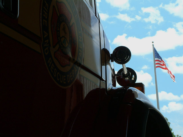
This is a fire engine at my station and I thought that it was an amazing day as I stood and watched the flag, I saw a good picture in my mind. I know that it is under and over exposed but I thought that is what made it unique.You can stil see the department logo in the shadows, Anyway this is my transportation
Statistics
Place: 211 out of 246 Avg (all users): 4.4085 Avg (commenters): 5.1250 Avg (participants): 4.2830 Avg (non-participants): 4.5327 Views since voting: 1242 Votes: 213 Comments: 16 Favorites: 0
I like this shot alot. I understand wanting to use a silouhette in a shot, but the fire truck has such great colors, I would wan't to see another shot with more color.
Maybe my monitor needs tweaking - I can scarcely see any detail on the door panel. The title intrigued me: the image is TREMENDOUSLY strong and grapphic, but I'd love to see the logo better.
I like the idea you have here, but I can barely read the logo on the truck - better lighting would have gone a long way to help this photo. I like the flag against the blue sky - nice job.
perhaps a fill flash or reflecting light onto the side of this vehicle would have increased the effect. Because the flag is in such a bright area by comparison, the viewer's eye is drawn to it rather than the intended subject.
The transportation subject of this shot is too much in the dark here - I don't know whether that's deliberate or not but it feels too subdued to me. Pity because it looks like a very clear shot.






 Add photograph to your favorites
 Add photographer to your favorites


