I think this will generally focus on my comment during the challenge, so it might not be real long. This is genuinely 3 very good pictures. I'm just not sure I like them together. I'm not going to follow my normal format either. I'm just going to ramble until I feel I've made my point. Or until I figure out that you know better than I do and then I'll just give up :)
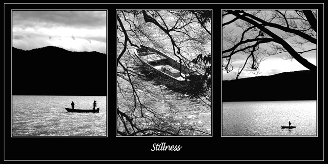
I felt like the middle image disrupted the continuity of the other 2 images. The other 2 images are awesome silhouettes of some landscape and 2 fishing boats. The center image is an unmanned boat thru a tree or two. The branches in that picture oppose the ones in the rightmost picture and I feel that kind of makes the pictures do the same. It might have been better placed in the first or last frame instead of the middle. I'm trying to picture it that way, but at least in my head, it still doesn't fit. I think the best example of "stillness" is the third pic. I think it's in the spot it needs to be to fulfill the title and leave the viewer with that image. The leftmost image is pretty good, but the water looks a bit choppier and there are 2 guys in the boat.
I keep having this odd sensation about the middle image, like the guys have fallen off the boat and it's washed up to shore here, under this tree. It's kind of morbid and all, but it's the picture in my head that this keeps reminding me of. Maybe if there were a man fishing in it quietly it would not make me think of that. Well for what it's worth, these are my thoughts on this photo. I hope it doesn't offend you at all and I'm not saying it sucks or anything. You beat me :)
Keep taking these wonderful pictures the rest of your time in Nippon and good luck with moving. - Bob
(It was you who said in the forums they were moving right?)
Great idea. Perfect in b&w. Perhaps I had chosen to mirror left picture to make it "look" into the center. Overall a triptych I like very much. Well done and good luck!
nice series and atmosphere, since there is already a sense of symetry given by the images, i would not have centered the caption. White lines around each image are probably not neccessary. Try to create your lines when the image has been changed to the size you will submit it, you will get a much cleaner result. 7
the photos are very nice. the alignment is a bit off at the bottom of the middle photo, and for your choice of the third photo it might have been even more powerful if you had the lake w/no boat in it.
I love this. The black and white shots look perfect to me. The only reason I'm not giving you a 10 is because the middle shot doesn't evoke stillness to me. For some reason I'm seeing choppy waters and a boat that lost it's crew.
I like your presentation. Nice photos that would stand out on their own individually too. To me the water motion does not represent "stillness", but that's just me.
I love the solitude this portrays, and the bw makes it particularly effective. If you put it on DPCPrints, please PM me and let me know. This is awesome!!!!
Makes me want to go out on a boat, that's for sure. Wonderful tones and lighting here. I kind of wish the 1st and 3rd panels provided more diverse points of view on this subject.
Nice composition. The middle and right photos are very nice, but the one on the left seems like it's missing something. The branches add a nice detail.
Pretty good. The composition might be better if there were no outside white edge (around everything), that is, just a big black border. The letters need to be much bolder, possibly off-centre?







 Add photograph to your favorites
 Add photographer to your favorites

 Photographer found comment helpful.


