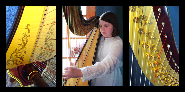
Marianne, had given you an 8 but had no time to comment. Like how this presentation give a good sense of what is must feel like to play the harp. The framing with the yellow harp details is rather bold, but it works and very effective in telling the 'story'. Good job!
This was a good choice for a multi-image shot, because the right and left side shots are good shots, but without a context they would be hard to identify for someone not familar with the harp. However, the middle shot provides that context, and therefore makes the other shots more effective. Good work. 7
The proportional frame is good, though it could be a little heavy and dark. Subject of harp player and especially the instrument is interesting. The image is balanced and formal... and thoughtfully composed.
VERY nice, and what a talented child. You must be very proud. I find the carpet in the first frame a little distracting, but thats the only thing maybe I would change. Good job. 8
Nice. I like the colours, in particular the yellow and the two blues at the opposite top corners. Possibly the composition would have been more effective if the interior margins (the blacks between the three pictures) would have been smaller than the outside edge.





 Add photograph to your favorites
 Add photographer to your favorites

 Photographer found comment helpful.


