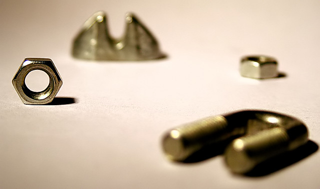
Kevin - in all honesty, when i first saw this photo (as a thumb), i didn't like it much, then in full view i was 50/50 and as the challenge went on it grew on me every time i saw it eventually ending up as a 7 haha. As others have said, the lighting is good, as is the DOF - but it did take me a little while to get over the initial consideration of the DOF that you chose.
I like the frame/crop a lot, i feel the elements are nicely balanced.
I would have liked to see this in black and white - the properties of the object lead them selves so readily to be silver-grey rather than have an orange tinge imho. Also, a whiter white and an blacker shadow would have given the image a bit for "wow" factor for me.
I don't know why someone linked you to the size faq, it was completely irrelevent for this entry - must have had tier wires crossed!
Definately an image to be viewed more than once!
I thought your shot was technically excellent and I gave you a 7.
I thought the depth of field was well executed and the composition was solid.
However, like the other commenter, it lacked a sort of emotional oomph that I think it would need to put it over the top witih the voters. I'm not sure how to say that would be accomplished with this subject - perhaps more of a demonstration of the forged strength of the objects featured or comparing them to plastic or some other inferior material.
Typically I bristle at a macro shot with very little depth focus. But this looks very intentional ans definitely defines the image. Nice job on the single focus and attention grab.
DOF is normally to draw attention to the subject, but the layout forces me to keep looking at the blurry bits. Nice shot, but my eyes are getting the runaround. :)
nice play on positioning using the rule of 9. but the other objects are overly OOF. i would appreciate it more if the blurred objects was "slightly" in focus





 Add photograph to your favorites
 Add photographer to your favorites

 Photographer found comment helpful.


