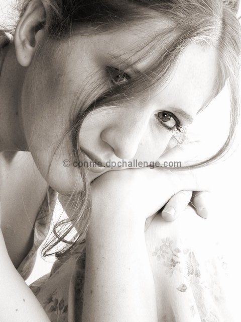
I don't understand MandarinElements comments (although she's entitled to her opinion). This is an excellent shot! The lighting is fabulous, the hair coming down on the face, the pose, the expression; it all works so well. Someday I'll be able to shoot this well (I hope!). Wonderful job!!
I think this photo was very nice, but I don't think it was that interesting. It seems just like a picture of someone, I mean it doesn't seem like there's anything special about it. Maybe if you had something happening, have her hold something, have more shadows, a darker backround, maybe something in front of her but not blocking her way, eh? Maybe it could seem as if a person was looking at her through a window
This would have been much better if you had been able to keep some detail in the highlights. It would still have been possible to have the light airy mood. I like the tight cropping around the face. The lighter area with hair strands behind the head is distracting, the crop could have eleminated that without unbalancing the image.
This looks very professional only thing wrong with it is that the fabric on her knee fades away into the light as well as the detail on the edges of her hands
Nicely done. I'm guessing some people won't like the overexposure on the right, but it works for me. I've looked for suggestions to offer, and simply can't find any. So there ya are.
The hair strands and the composition are perfect. I know people have already mentioned the blown out areas and maybe you went a little too far with it. But I really love it regardless, one of the best portrait shots I have seen in a long time.
I like the pose and the expression. her hand and her dress though, seem to blend in with the white background (at least on this monitor). while I like how the curve of the piece of hair mirrors the curve of her cheekbone and jawline, it bothers me that it's in front of her eye. Of coourse, it gives it a more casual feeling, but I think pushing it to the other side of her eye would have made a difference.
Well...I think we all know this is goood self portrait photography. Interested to know how you got such nice lighting. I tend to get harsher shadows but I don't have any studio lights yet and depend on a lot of natural, one directional window light.
This is an exquisite portrait photograph... I believe that the minor glisten in her eyes really sets this one off.. I love it and I'm giving it a 10 for a job well done. 10 means VERY GOOD right? This is better than VERY GOOD but I want to make a critique anyway... I like the lighting tones across her faceis very nice and I like the deviation of light tones from one side of the hair streak to the other... However, I believe the light on the right side of the frame is a little 'hot' and her fingers and dress are washing out quite a bit. I also really appreciate the mild sepia tone that has been applied to this image. It makes it MUCH warmer feeling than a standard black and white... GREAT JOB!
A very nice portrait. The background is so washed out on the right side and even effects her dress, but the rest is so nice, I don't know what I could suggest to improve....maybe change your lighting a bit. Photo 8 Creativity 7 People 8 total 8
Very nice photo. Seems a bit too washed out lower right, maybe less hair in front of her eye, and the 'hole' in her ear (maybe an earring next time) but she is too pretty not to make it a great photo. Good job.
Very good photo. My only problem is the level of light. Not sure if you were attempting high-key or not. My opinion is that it is not bright enough for high-key effect, but otherwise too bright. especially the forward arm-wrist-hand. Still gets a 9, but I think I would have given a 10 if either purposely "high-key"ed or darkened up some.
she'd be beautiful in any month ;) The only thing I would change would be to thin out the tendril (sp?) of hair in front of her eye, otherwise great photo.
Beautifully done. The high-key falls apart a little inthe ULHC - maybe a reflector would have helped with the shadows behind that strand of hair and on her neck. Biggest little nit is that you've lost half a finger to overexposure. High marks from me.
Beautiful eyes. Like the lighting, separation from background and wistful/ urchin feel to the subject. The shadowing is good to a point. The 2 tone face is a bit uncomfortable.
Let me be the first to comment on how absolutely beautiful this composition is. I absolutely love it. The lighting is superb. I'll have to write more about this when I can...right now, I'm just amazed at how wonderful this shot is. (Later) Ok, I know why I really like it (aside from the lovely subject), you managed to capture this persons humanity. As someone told me, anyone can capture beauty with people, but you somehow have to also capture their humanity. Bravo!






 April in May
 Add photograph to your favorites
 Add photographer to your favorites


