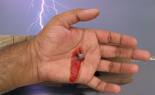
I think the idea is okay but the image is not convincing to me. I can tell that is ketchup and the background is just all wrong to me. especially with the city lights.
Cool set up. I like the background too. Tho the lighting quality doesn't quite match foreground/background, the foreground is too indoor-looking. But it's a good and creative shot.
I'm not sure what to make of this photo. Overall, it's difficult to believe. The lighting makes the ketchup very obviously ketchup and not blood. The lights on the right side of the waterfront throw the photo out of context with the crucifixion timeframe, and Golgotha was nowhere near water, as far as I'm aware. Maybe if you cropped/edited out the lights, switched to b&w, and gave it some dark shadows, it might be a more believable photo. I know this probably sounds overly critical, but I don't see the point in marking you with a low score but not saying why.
Photo is sharp, clear and well lit, but the blood looks like catsup, and it's just not a believable shot. The background has a fake, backdrop look about it. 5
my goal is to comment on every photo in this challenge..heres urs..good luck..good comp and focus. i dont imagine this is doing well with the eye candy crowd.i think this image is too wide a subject to relate to metal tho u do have that one tiny screw in it.ur BG choice has me a bit confused but i understand the whole "jesus on the cross" thing u were doing(i hope i got that right.)
Ew. Too gross for me, and blood looks remarkably like ketchup. The skyline in the back on the right doesn't help. I'm sorry! This might have worked better with more interesting lighting - darken it up, add some shadows, skip the background photo. Darkening it might make the "blood" look more realistic and the hand less healthy. I'd also change the angle a little so that the hand and board aren't comnpletely horizontal.
If that weren't so obviously tomato ketchup and there wasn't the waterfront (?) spilling out on the right, this would have been a great shot conceptually. 5
Symbolic idea, however, the partial cityscape showing at the right where the middle finger is distracts and is way out of place. Otherwise creative. By the way, you can tell the "blood" is catsup.
I'm sorry, but this is so horribly bad. The ketchup, the background photo, a tack, the wordy title... Next time at least cover up the cityscape lights in the background photo.
I appreciate your theme, but the execution is not convincing for me. The metal is hard to see with the fake blood and other distractions (lightning, cityscape, etc.) Perhaps a closer shot of the nail in the palm?
The blood is obviously ketchup - hurts the image. The lightning may be ok, but the city lights on the right remove it from your context. To be more correct, your 'nail' should not be pointing down as you would slip off - one of those technical things. At first look I thought distasteful to be honest. At second and third look, the same. It boiled down to the technicals on this one.
I love the lightning effect, but the city lights beyond the fingertips spoil the effect. I really appreciate what you were trying to achieve with this image. Keep up the good work!
I think the blood looks a bit too much like ketchup...not dark enough...the "nail" looks more like a tack really...and I think perhaps the lighting is a tad flat...to be completely truthful though...this really speaks to me more of sacrifice then of metal when all is said and done.





 Add photograph to your favorites
 Add photographer to your favorites


 Photographer found comment helpful.


