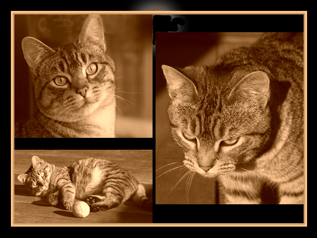
I love cats and this is a great collection of cat pictures. Each picture really is great on it's own. The background with the white and the dark outline takes away from this shot and the duotone of the cat pictures seems very weird to me. All in all a fantastic shot of your cat! 10!
The eyes are a little light on the lower left image, but after having taken dozens of photos of my own cats, I know how hard it is to get a decent photo without flash. I don't understand the light/dark areas in the upper background, though.
Good expressions on the cat. I don't care for what looks like a ring of light on the black background at the top. It pulls my eyes away from the real subjects.
the photos are very well done, but it looks like you had some problems with the combination, ie: uneven borders, the wierd white-ish blob partially blocked out in the top center, etc.
What's that in the background there? Looks odd. If I were to change something, it would be to have all three photos at the same exposure... the bottom left photo seems slightly more exposed than the others. I do like the duotones here... works well with this cat's fur.
3 great shots and i like the sepia but its a shame about the messy bit top center that looks like you have tried to correct. Apart from that it`s very good.
Im not a big fan of cats, or cat pictures, but this is nice. The sepia tone works extremely well, and the cat is actually doing something! Good luck in the challenge.
The biggest picture is the weakest of the three - Also if I follow the gaze of the cat, all three lead me out of the picture frame without a strong compostional element to bring my eye back. Once the viewer's eye travels out of the picture he thinks "okay, I'm done'.
You've portrayed well three of the many attitudes cats share. Being raised with these finicky creatures, you surely never know what to expect next. But we do love our kitties, don't we? Love the tone used.
Oh ahgg! You gots an oops! Anyway, I love the different takes of the kitty, especially the look on his face in the top left pictures and him playing in the bottom left. The sepia tone that you used is great and fits for this pictures. I'm not sure as I like the border around only the outer edges of the individual photos. Perhaps using it around the background would have been better. I tell you what...since I like this picture I'm going to ignore the oops at the top of the triptych because I know you didn't mean to submit it like that. Good luck in the challenge and I hope you aren't going to be inundated with "hundreds" of comments about your oops.







 Add photograph to your favorites
 Add photographer to your favorites


 Photographer found comment helpful.


