Author Thread
Post actions
hey, I got a picture that looks almost like yours...
Post actions
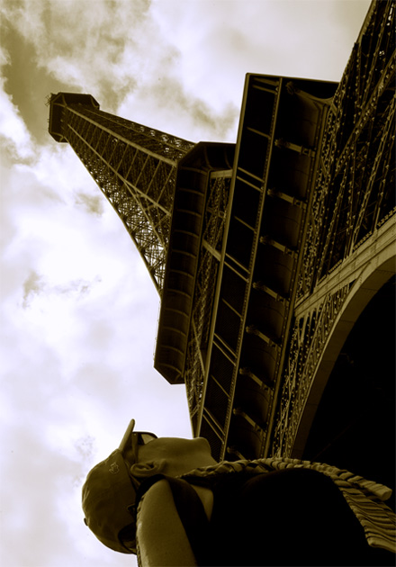
Great perspective and I really like the tones. The person is somewhat of a distraction, but I can see how it adds to the interest for some.
Comments Made During the Challenge
Post actions
Post actions
Post actions
Great perspective, but I think it would have been cleaner without the person in the bottom edge of the photo--from a graphic standpoint.
Post actions
Creative composition. I like it.
Post actions
i like the perspective of how tall this is, sepia works well with it too
Post actions
Nice angle. Other than depicting the true awe of the tower, it does create an impact by the gazer forcing the focus to the object "Metal". ALL ROUND stunning.
Post actions
great angle.
Post actions
the tourist doesn't add much...
Post actions
I love the sepia. I dont know about the angle though. Something tells me I like but, the the other side of me is distracted by the angle, which takes away from the overall feel of it. Great shot though!!!
Post actions
We all know that this is a metal challenge. Excluding the word "metal" would reflect a differant perspective, and strengthen the title.
Post actions
Another entry. I thought this would appear. Good view. Color? Less of the person? This was not the dynamite I expected but it has the subject clear.
Post actions
need to rotate image to the right..6
Post actions
Rule of thirds, leading lines .. you got it all! Good shot.
Post actions
You got a sore neck now? LOL I like the the composition and the toning. I'll rate it a 7.
Post actions
Great idea to give a sense of height however I feel that the angle is too acute. I think the image needs to be rotated 90 degrees clockwise.
Post actions
would have liked it better without the person
Post actions
Nice composition - quite a moody tower shot, certainly conveys it's awesome size well
Post actions
Love this. Not sure if the person adds or detracts. Love the tones, POV, composition. Great job! 9- good luck in the challenge!
Post actions
Post actions
The person is distracting in this photo. 6
Post actions
Wow...Dramatic angle/POV. I like the hues and tones in this one. Nice work.
Post actions
I like the shot better before the person loaded...
Post actions
I think I would have cropped the person out, well done and good luck
Post actions
I opened this picture and rotatd it in my picture viewer and I liked it better the way you initially shot it. Just my opinion but I think that you tried to make more of this and actually made it worse. (sorry)
Post actions
Not crazy about the olive green. Great perspective, but it's way too dark.
Post actions
love this picture...I probably would have scored it higher than a seven if the person wasn't in it. But still a great pic!





 Add photograph to your favorites
 Add photographer to your favorites


 Photographer found comment helpful.


