Denise, i wasn't the biggest fan of this image, i gave a 4. While it is in focus, crisp and evenly lit, it lacked the personal flavour of the individual photographer that i tend to see in images i vote higher.
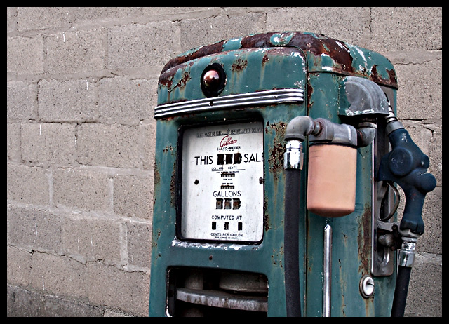
My first impression, based on the composition and angle of this photo was that you walked past the pump, realised it was appropriate for the metal challenge and turned around to take a snap. I wondered why you chose to take the photo at this angle, why you decided to cut the pump off where you did, why you took it at this level/perspective - and from the picture alone these questions were not answered.
An old rusted pump like this has seen some stuff in his days - he has a story to tell, and i felt you missed the opportunity to capitalise on the intrigue of the subject matter.
You technical aspect ids excellent - but don't be afraid to put a little bit more of yourself into your work!
Color and rust make good contrasting elements in the composition. From this angle offseting the pump from center is all right.
The visible metallic components make this image clearly meet the challenge, but some reviewers will not think it a strong connection.
In general the image is OK but there are things to consider for improvement that involve technical quality, perspective and composition.
First, the near tubing and piping connected to the pump are closest to the camera and slightly out of focus compared with the wall behind on the right. That should not be. You shot this at f/3.2. If you reshoot with a tripod mounted camera at a higher f/stop then everything can be in focus. The colors are somewhat dull. You might consider bringing out more of the green and more of the rusty redness to highlight the metalic nature of this pump even more than it already is. Techniques of lighten and darken applied to the pump will give it depth and highlight its features.
Next, the image is taken from an uninspiring, eyelevel or 'snapshot' perspective. Looking at it from any steep angle either above or below eyelevel will add a lot of interest to the composition. Angled shots, if chosen, should always be exaggerated both for added viewer interest and to make plain that it is not an issue with the levelness of the horizon.
Lastly, the cement brick background adds little to the composition. You could try applying dodge and burn to add texturing to it but you probably should select a closeup shot of just the pump and crop out as much background as possible. This will enlarge and improve the quality of the detail on the pump itself. If the price of gas is readable where it says "COMPUTED AT" you might try to show that in the image. Viewers would find that VERY interesting.
I'd like to see more of what's cool in this photo, and far less cinder block. I've found that cropping into what I found fascinating about the photo simplifies it, and makes it stronger
we all know its a "metal" challenge, why not just say "old fashioned" instead, it gives alot more power to the title.
nice color, nice lines, comp needs work, b&w good, nice texture, ok overall
I like the way this shows the texture of the metal and overal color tone. It looks a little fuzzy however around certain parts of the pump, maybe it is from resizing.
I love the angle, don't like the brick on the left so much...maybe half that much? Nice detail, good color - love the contrast between the rust and the green.
This one I like! Composition, style :) Good job :)) I will show u my night shot of an old fashioned russian gazoline station if u remind me after the voting is done. Best of luck!





 Add photograph to your favorites
 Add photographer to your favorites

 Photographer found comment helpful.


