Arni..those other shots are fantastic. The model you were using has a power in the camera. He needs to be a front man for a band or in the movies. He has a very powerful presence.
I know you have a nice camera so you are not limited there and I am glad you make the most of it. I don't know what your photographic/design schools are like where you live but obviously we have a media freak out society over here in the states and you could find all kinds of options. Maybe a large city like New York or L.A. will give you the place to study AND do photography on the side at some studios or whatever.
I think, based on some of the comments I saw, some folks need to start studying some photography outside of this web site.
This photo is so good on so many levels arni, as most of your photos are. For someone your age arni have you considered a career in photography? I am not a photography by trade but I know a lot of them and you are as good as any I work with. Great photo...leave us amatuers alone :-)
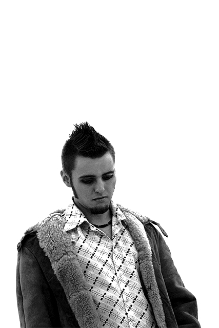
The use of negative white space, the level of contrast, ...oh fug it!!! I am preaching to choir here arni.
Was this taken in snow? I like the edgy composition. You have the zones covered among the face, background and jacket. The shirt, although it's lovely, is too bright. I'd go with a darker one. (this may be a repeat. There was a glitch when I entered)
I love the framing and focus of this shot. An excellent entry for black and white, too. Very nice job with the lighting... how'd you pull this effect off?
So good... Great contrast and detail, and the composition works for me. Digging for nits, I do notice that the skin on his face has picked up some digital blech, and some shadow detail is missing. A little positive gamma and punch up the darks a little to keep the contrast and it would be perfect. Congrats!
I really like this photo. It makes me want to go out and take portraits of people only in the bottom half of the frame and leave a lot of white space. I like the subject, the expression is great, and the white space really enhances it. It makes the "disappointment" more poignant because it makes the subject more insignificant, blah blah. If you are getting comments to fill the frame more, ignore them, because those people are wrong ;-)
Nice focus, I like the stark white background. Good expression on your subjects face for the title. I would have prefered less "white" space at the top.
I keep coming back to this picture--I just love it. I do wish it was cropped way down from the top--or put a thought balloon up there to tell us why he is so sad! ;) Fabulous capture of mood.
How did you "wipe" the background? Extra point for the only pure person photo, but wouldn't a background have added interest, or explain why he's disappointed? Eyes appear as black holes, probably not a good choice of effects. Photo 9 Creativity 9 People 9 total 9 (personally, I didn't like this photo that much, but there isn't any one thing I can put my finger on and say, this is bad, so you get a good score anyway.)
I don't understand the white space. Crop in closer to the portrait subject to direct your eye immediately to the expression. Otherwise a nice mood shot.
Very very very very cool... not just the perfectly white background and the crisp black and white and the framing, but also the expressiveness of this guy's face and stance. And his cool hair :)







 Add photograph to your favorites
 Add photographer to your favorites


