|
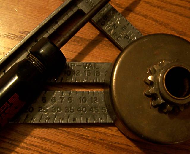
Lovely placement composition with just enough exposure of each object to suggest its purpose and value. Improvement might come from adjusting the temperature slightly cooler. The ruddy hue is warm and friendly, but it would be nice if the blade of the tri-square were a wee bit more metallic than wood-like in tonal texture. It seems almost greenish-yellow where it might affect more contrast and stand out better if slightly more bluish. 8. |






 Add photograph to your favorites
 Add photographer to your favorites


 Photographer found comment helpful.


