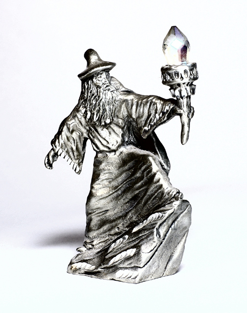
I think this image would have been greatly enhanced with a blue background. The white competes with the highlights, making the entire image washed out.
The wizard looks a little flat - perhaps the stright on lighting did this. A little more side lighting and it would add some depth I think. Good job with the placement on the background, but again, I think you could have cropped with the wizard to the left of the shot a little more to have him staring "into" the shot. Applying the "rule of thirds" here possibly would have made the image more interesting.
Love the figurine. It would have been a nice touch to place him in some grass or against some natural background. For me the white is too harsh especially with the brightness on the wizard.





 Add photograph to your favorites
 Add photographer to your favorites


