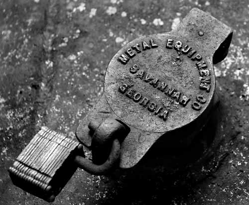
Wayne - i gave a 6, but i think i was a bit stingy and you deserved a 7. The lock lent itself well to black and whte, for the most part the image is crisp and clear. Nice texture, nice composition. That the padlock doesnt seem to be crisp bothers my eye a little - did it move sligtly? With a f6.3 it shuldnt have been out of focus due to dof. That was my one little nitpick. The company name (and of course you titles it the Whole company name :p) added that little personal touch that i like to see in photos. Overall a very good entry for the metalchallenge.





 Add photograph to your favorites
 Add photographer to your favorites

 Photographer found comment helpful.


