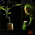
Not perfect, but the best I could do after many many many photos (do you know how hard it is to pick dandelions in the rain, get them in the car w/out blowing away and then get them home to take photos? ;)
The bottom one is a little more grainy than I wanted but I just couldn't get it any better. Here's another tough one for you: arrange the dandelion seeds the way you want them ... they don't cooperate well.
All in all I still had fun though :)
Statistics
Place: 2 out of 116 Avg (all users): 7.4545 Avg (commenters): 8.6563 Avg (participants): 7.4516 Avg (non-participants): 7.4600 Views since voting: 8790 Votes: 143 Comments: 53 Favorites: 17 (view)
Congrats! I'm glad to see you win another ribbon here! Great image, and after reading your comments, it sounds like it was difficult to put together!
JD Anderson
I don't care for the way the title is inserted, nor the font used, but the photos are just so spectacular (particularly the upper right one) that it's easy to look past those nits. Well done!
This shots looks great in black and white and fits the challenge perfectly. Each shot is great alone and together theses 3 shots are excellent! Great job! 10
The lighting is excellent and I really like how you captured each individual "fuzzy" (can't think of the actual name). Almost looks like sparklers. Great job.
They seem oh so slightly ouf of focus, when exact clarity is needed here, but the B/W works wonderfully, and the images really create a synergy. Very nice tones, too. Lovely image. 10
The pictures are great! B&W looks perfect, and your composition with the three images is very nice. I don't quite like the bar with the title in the middle. I think it would look better without the bar, and give a little more space to the right and left pictures. Good luck!
I adore the photos in this triptych. The choice of black and white works very nicely, and I especially like your "theme". I am not totally crazy about the font that you chose, I think it detracts just slightly from the overall image by constantly drawing your eye away from the photos. I think that I would have preferred not to see any text at all, however, that does not keep this from being one of my top picks.
Very nice series! Good detail and nice imagination to come up with this! The lower cell is just fine, emulates flight well. It would have been truly impossible to catch them in real flight, but I would have liked it a touch better (how many years to do this???). 9 Rob the Swash
Very cool sequence. really like the bottom one. I'd rather not have the text however. I think it takes away from the simplicity. The inside borders seem bright for me. Maybe it's the thickness? Not sure. Good lighting and a unique subject.
Wow. I\'m not sure there\'s anything I can recommend to improve. The contrast and crispness is wonderful. The images flow together with each other perfectly. Each individual image is powerful, yet is more powerful in the presence of the others. The composition of the multiple images into one is excellent. If I wore a hat, it would be off to you. Beautiful work. 10 without a single second thought. I hope this wins.
Incredible macro work!!!
I like this alot, and BW works very well here.
THe only thing I find distracting are the horizontal stems in the left side of the bottom image. The entire compilation is made up of vertical elements, including the text. With no editing rules, I would have cloned out the horizontal stems... They seem out of balance with the rest of the compilation.
I still give it a 9, though. Would have been a 10 without the horizontal elements.
JD Anderson
really nice series of pictures, especially the one on the right. I would realy forget about the caption on this pitch black background. 8 for the photographs
This is my favorite so far. It's perfect. Quality of pics is high and the presentation has a very nice polish. Also, the multi-image presentation make sense here, unlike with so many other submissions. Beautiful layout, like the Breaking Free, tucked in the middle, with a nice font. This image is so playful and everybody can relate to the wonders and fun of blowing these things. A very well-deserved 10 Journey
Great details and the bw is particularly effective. I really like how the bottom picture looks like the seed things are blowing end over end upon first glance. Great work
Great concept and executed well. The one thing that bothers me is that the text box is deep black and there doesn't seem to be any deep black in your images. Either add more black to your shots or tone down the black in your text box.
beautiful work... this is probably one of my favorites in this challenge. Each of the three images has strong photographic merit on its own and the composition represents a theme/story that doesn't require any explanation to me :) This is a great black and white series... excellent work... = 10 - setzler






 Breaking Free
 Add photograph to your favorites
 Add photographer to your favorites


 Photographer found comment helpful.


