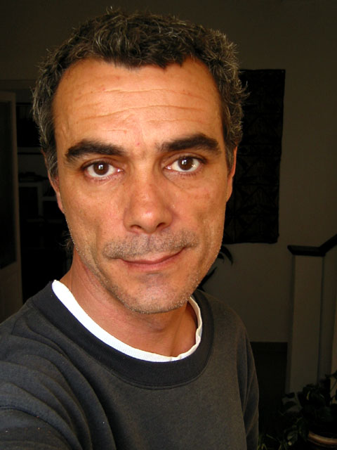
I liked this image a little better in the thumbnail because all of the blacks faded together. Could you adjust the levels on this shot to get the darks just a little darker so that they did? I think that effect would really make this image stand out. As it is, I'm just a little distracted by the objects still slightly visible in the background.
Nice portrait of a weathered man. You would have done better with some kind of a back drop rather than being able to see parts of your house. Lighting might work well in some circles but I would have prefered a half lit face for more dramatic effect. Oh yeah, the self-portrait challenge was a few weeks ago. ;)
Good color, but in this case, the background shows up too much. (Are you an infrequent shaver, too?) Notice the t-shirt wash out on the left. Photo 9 Creativity 6 People 9 total 8 (if you could have wiped out the background, this would have been a 10, and lose the t-shirt, it's toooooo white for this shot)
I like the starkness of the photo. Others may disagree, but I would have placed the subject in the centre of the photo. The blank space to the right does nothing for me. Front of the forehead looks just a little bit too shiny.






 Add photograph to your favorites
 Add photographer to your favorites


