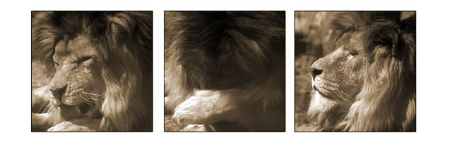
Well, the first thing that catches me here is that the boarder is excessive. I think it would look much better without the large left and right white space. I'm not sure why you chose to use a boarder that dominates the available space so much, especially when your space was already so limited, because it leaves all three of your pictures very small. The details in these shots are hard to see (both due to lack of contrast in parts, and the small size). The center shot seems quite uninteresting as well, since you can hardly see enough to tell that the lion is resting his head in his arm. I think these shots had a lot more potential than this composition shows. Perhaps another atempt at editing them together into a series (and maybe only using the first and last shot) would be worthwhile. 4
Quite nice photos! The middle one is a bit confusing, but after looking at it, I realize it looks like he's hiding his face from the sun. lol Your focus and clarity on the subject seems really nice. I really like the sepia tones. What a beautiful animal. Good luck in the challenge.
Good concept, nice use of sepia tones. The picture in the middle is a bit too dark. The pictures need to be aligned a bit better (space between 1 and 2 is larger then space between 2 and 3, left to right). I like the bigger side borders.





 Add photograph to your favorites
 Add photographer to your favorites


