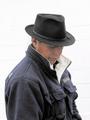
OK, I confess, I was taking photos of the powerboat races this day, and happened to catch this kids just messing around on the beach before one of the races was due to start - I can't remember what he was doing during this particular shot, and I don't think he ever noticed the camera being pointed in his direction. The fact that you can't be quite sure what's happening I hoped would make the image a bit more intriguing, which is why I went with this particular one.
The final shot was cropped quite a lot to get the boats, buoys, and the pier out of sight, leaving just the bands of colour, which is also why I chose portrait. The shot was very grey (typical British summer ;o), so I used the 'enchance' auto-levels thingy of my graphics software to bring out the colours of the sea. As for the focus, I couldn't do much about that, as I was trying to shield my eyes & the lens from the sand being blown straight at me at the time...
The variety of colors is nice. I think the person needs to have more prominent (re --bigger) role in the picture. It almost looks like you were taking a picture of the water, and this guy accidentally ended up in your picture.
I like the layers of color in this photo. The person is well placed, but I wish they were doing something else. Even just standing with their back to the camera. (Skipping a rock, bent down to look at something, etc.) It looks like they're trying to read a letter on a windy day, but I just can't tell.
I liked this photo from the start becasue of the incredible color striping going on here. If the person had been a bit more compelling to match up with the shear incredibleness (is that a word) of the ocean colors you would have been one of my favorites.
As it is your photo and "leaving" are fighting it out for my last top 10 spot!
Love the ocean here. And the way this photo was cropped to minimize the presense of the person adds to its dramatic effect. I think my inclination would have been to go with a landscape crop, but this works better.
The bands of color are what really make this for me, the "bothersome" part for me is the person, can not figure out what he's doing, wish he would have kept walking, but then it wouldn't have fit the challenge....oh well, like this anyway!
Pretty good shot. Maybe more person and less ocean, but otherwise, really nice. Was it windy? Parts of the subject appear slightly blurry. Photo 9 Creativity 7 People 7 total 7
I really like the muted colors of this shot. I think I might have like the overall shot a little better if it was a horizontal shot. A lot of sky in this cropping.
I loooove the beach! Nice composition using ROT AND the horizon is level (which seems to be a real problem on this site! :) This is just my personal opinion, but I would've liked the person to play more of a dominant role in an entry for "people". Also, what is the person holding in the heands? Can't really figure that out.







 Add photograph to your favorites
 Add photographer to your favorites


