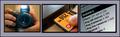
FIRST IMPRESSION: The frame looks like it's made of wood. Nice color splash in the outer images.
CHALLENGE: This submission is for a challenge requiring 2+ photographs, and you've met that portion of the challenge. The 'rotation' of the fans through the three images enhances the relation the three images have just by their similarity.
COMPOSITION: Colors are good, clarity is good. The middle fan is too dark, but the outer two look very nice. The inner frames help break up the whole image, while the relationship and positioning help keep it together.
TECHNICAL: The center fan is too dark. Also, in the top image, there is something (a hand maybe) below the fan which is somewhat distracting. However, the overall image is good, excepting the center fan's being too dark.
CONCLUSION: A very nice entry for the challenge. Aside from a lighting issue, this is a well-developed image which definitely has potential.
Thanks for sharing, and good luck in your future submissions.
I really like the center frame and how it shows up in minimalist ways only, however, it doesn't really fit into the tone of this sequence very well, since the other two show up very clearly and strongly. I think putting the center shot against a white background would have created an interesting contrast with the other two shots, but still maintained the same tone as the other shots. 7
This was a good choice for a subject. Somewhat there is to much empty space in the composition. Could have perhaps tried to have used frames of different sizes, close up views of the fans or have the fans overlap.
Beautiful idea! I like the colours, the layout, and the way the fans point from one side to the other. I think the composition would be more effective if the middle fan were stronger, consistent with the colour strength of the other two.







 Add photograph to your favorites
 Add photographer to your favorites


 Photographer found comment helpful.


