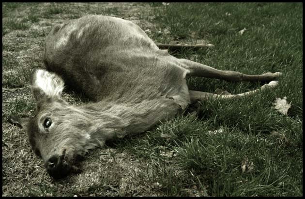
I really don't find this photo very pleasing as I'm sure many have commented on. You were very brave in submitting a photo like this in the challenge. It definately emits an emotion of the "poor Bambi" effect. It was fitting to desaturate the colors and it works well. There is absolutely nothing wrong with the technical aspects of this photo from what I can see....it's just an icky subject and one that most people will vote down because of it. I'll be interested in finding out where you place.
oh, break my heart.. this poor creature. i am attempting to think of a critique, but the picture is dim, and it works for the message you are conveying...man I think I'm gonna cry.
a disturbing image, death and greenery; almost a metaphore for Spring. The muted colors seem to make it a little more of a 'stealth' photo, it intimates the metaphore rather than screaming the contrasts.
I really like the way how you change the colours. It adds so much to the picture, it almost makes me sad. Excellent photo you will get the first 10 I've ever given here.
The desaturation works well - all the color is drained out of this life. Nice composition with the face gazing off into the corner - and a line of grass/less grass down the center.
Good image. De-saturation is just about spot-on, though there might have been more impact from a really 'pretty' treatment of the idea to bring out the contrast with the subject? Good work





 Add photograph to your favorites
 Add photographer to your favorites


 Photographer found comment helpful.


