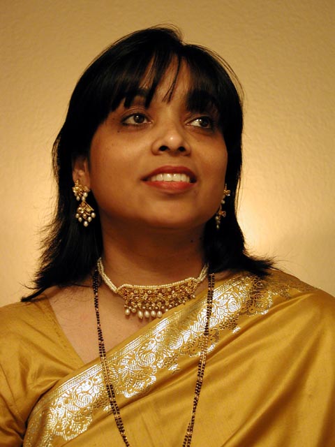
I think a more contrasting background would have made this picture stand out a bit more. Her dress and her skin tones are in the yellow range, so a blue or red background I think would have made them pop out some more.
A really nice photo. Just a nit, but are you looking up at her just a bit? A little more straight on, or back just a bit to get more of her costume might have been nice. Also a nit, maybe a touch dark, but really not that far off, could be my monitor even. Photo 10 Creativity 8 People 9 total 9
Nice portrait. A different background color, if at all possible, might have made the picture have a little more *pop* to it. The yellow garment and yellowish wall sort of blend together. I like the lighting you have used.
A nice pose, but I think the angle should have been a bit higher. Also the lighting doesn't do justice to the color and texture. My preference would be to have the backlight slightly higher and add major and minor front light sources to the left and right. This would bring out more texture in that lovely face.
This is a beautiful portrait! I can't come up with much critique on it, but I would probably have tried to offer a light in the background that created a little more contrast between the background and her clothing... good job!
Pretty subject, nice warm tones. Good separation of subject from background. Good separation of gold from yellow.The bright spot above her left shoulder is a bit distracting. Would like to lighten her eye area a bit. Would also like seeing this subject in silhouette as well.







 Add photograph to your favorites
 Add photographer to your favorites


 Photographer found comment helpful.


