Good idea, I wondered if anyone would use the blindness theme. Perhaps a different angle for lighting to create some shadow and highlights would give this shot more impact.
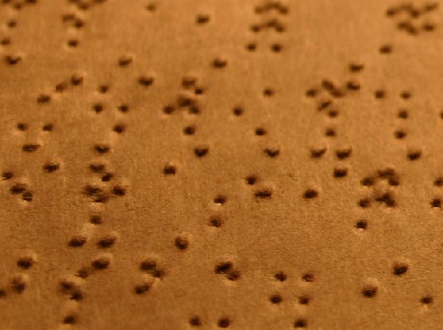
Good idea, but there doesn't seem to be an actual focus point here, just a random scramble of bumps. Perhaps better focus as a single point so that the eyes do not wander would help. Also the in focus parts do not look in focus, though it might be the compression on the jpg causing this.
Oh boy waht a brilliant idea, but let down in the execution.
Now with some low natural side light and a finger or two traversing the words you would have had a blue.
I have to knock off a few points because the image is bland and uninteresting, but the idea behind it has to count for something. ..... 6
Wow. This is an awesome concept. It fits the challenge beatifully, in a very refreshing and creative way to me. I wish I could read braille to know if there is more here to see. Unfortunately, I don't. Compositionally though, the shot doesn't seem very stimulating to me. Maybe a different grouping of elements would make a difference? Also I'm thinking perhaps a more even dof, showing the whole image in focus could have a stronger impact? Like I said, the idea is brilliant, if this is an indication of your normal line of thought and creativity, I'm sure you have and will have a lot of truly awesome photos under your belt.
Great idea! I think this meets the challenge very well, after all what's more dark than not being able to see at all? I think greater focus so the image was much sharper would help this quite a bit. Also, perhaps adding in fingers "reading" the braille might give the image another point of interest for the viewer as well as make it that much more personal as it seems to be missing.. something - at least for me. On a personal level for myself, I think it would do well in a black & white image to give it a feeling of loss of sight/color as well, just another layer of darkness so to speak. All in all I gave a 4.
Cool concept and good way of expressing what darkness is to you. To the viewer without the title this might be confusing. The shot as it is (crop) may have worked better with a longer DOF to where we could see all the bumps and pits in the frame in focus.
I may have used a person eyes closed (blind or someone pretending) sitting at a table in a dimly lit area, running their finger across the braille page as if they were reading.
I think your idea blindness = darkness could have been a top placer if executed differently. The shot as it is (shallow dof) makes it difficult to visualize that this is braille. A good thought provoking attempt.
without the title, i thought this was a macro of a paper towel. perhaps pulling back a bit to demonstrate a wider view of the language would be better? very nice take on the topic, though.






 Add photograph to your favorites
 Add photographer to your favorites


 Photographer found comment helpful.


