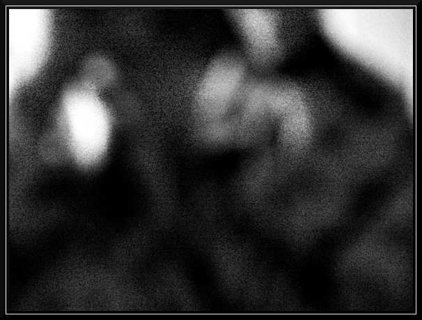
This is my interpretation of what those going blind due to age see. I cannot think of a much darker event than losing all the color and definition, not to mention beauty in life and being unable to do anything about it.
I think it represents darkness especially as it is someone who can and has obviously been able to see somethings previously, so their loss of sight is keener than perhaps one who has never had sight before. Like a long dark cover being pulled over their vision..
I do not doubt that people will assume it is just a happenstanced blurry photograph with no thought behind it, but it was intentionally composed the way it was and frankly, I like it. I wanted to give a blurred/out of focus image, devoid of color but with a hint of some definition as if the person with the old eyes could identify the shadowy shape of a person, but not much else.
Levels
Desaturate
USM
Resize
USM
Border
6-14-05 #6
Statistics
Place: 324 out of 373 Avg (all users): 4.1720 Avg (commenters): 6.5000 Avg (participants): 4.2800 Avg (non-participants): 4.1005 Views since voting: 895 Views during voting: 426 Votes: 314 Comments: 16 Favorites: 1 (view)
I see what you were going for here, but it doesn't work for me. Would like to have a tad more focus to make out the figures a bit more. Just my opinion though.
2nd pass to make comments...great take on the challenge. i dont usually care for noise in a photo but in this case it adds to the image. excellent use of B&W.*9* voted a 10 for above reasons and a bump for creativity
Concept for the challenge is good but the composition might not make it with the voters. Good full range of tone from black to white.
Excessively and purposely grainy images typically do not do well at DPC. That is because voters tend to think that is done more so to mask poor quality image than to make an artistic statement in an abstract way.
It won't be because voters do not "get it" but rather that they do not feel that you put much effort into the composition and that it is not 'true' high quality that they give it a lower score.
I understand the blur here, but it is also very grainy. As an image depicting blindness it does a good job but the image needs more smoothing to take away the grain.
I think the idea behind this photo is great. I do think that if the subject were more recognizable (it took me a minute to realize that it was likely your reflection in some surface) that the photo would be more effective. You earn points for being creative, though - this is one angle I haven't seen till now in my voting. :)
I like the concept but you should not need to rely on the title, maybe an eye shaped border or some way to convey the title through the photo would help. My 2c worth ... 5





 Add photograph to your favorites
 Add photographer to your favorites


 Photographer found comment helpful.


