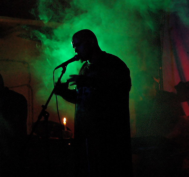
One comment to some of the posts: there's a fuzzy aspect on the green light/smoke in the low right. I think it was because of too much sharpness. I sharpened it before the crop and resize and after resize. I think this is why there's a bit of halo around the subject and the dot aspect of the low right smoke.
Sorry for the form-letter type commentary. I’m going to try to give almost everyone at least this breakdown to start. I would be happy to offer a more detailed opinion if you would like, though I don’t consider myself a very knowledgeable photographer.
Here is how I broke down my score for your submission.
Content: 2/4 (Is the subject compelling? Does the choice of content match the challenge?)
Composition: 1/2 (Is the work well balanced and successful?)
Color/Light: 2/2 (Is light and or color used with skill and artistic intent?)
Clarity: 1/2 (Is the picture in focus? Are the elements clear?)
For the most part this is a beautifully done image. The expression of the singer and the darkness of the place is OK, but the green mist highlighting the silhouette is terrific.
The disturbing part of the image is the exceptionally noisy looking bacground items surrounding the noiseless smoke. It is so grainy that it actually is distracting to the image. The wall on the left side of the image with the running wires adds little to the composition and you might consider cropping it out of th framing just right of the rightmost wire. The candle seems out of place because it does not seem it could privide the illuminating light for the green smoke and draws the viewer's eye away from the singer. There is some slight haloing around the singer but it is not terribly bad.
Despite these defects this is an excellent picture that has mood and instant eye appeal.






 Add photograph to your favorites
 Add photographer to your favorites


 Photographer found comment helpful.


