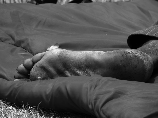
I can see the connection of homeless and how it fits the challenge, however, this image of a foot doesn't say homeless to me, it says this is someones foot, thus I find the connection starting to fall apart. To me, the static composition isn't very compelling. Perhaps a different perspective could strengthen this presentation. It is a good concept. Just my opinion of course :-)
I really like this image. It conveys the dark aspects of homelessness and works great in B&W. The detail and texture on the foot is well captured. If you cropped the top so that it was just clean material rather than a glimpse of grass it would have even more impact for me. 10





 Add photograph to your favorites
 Add photographer to your favorites


 Photographer found comment helpful.


