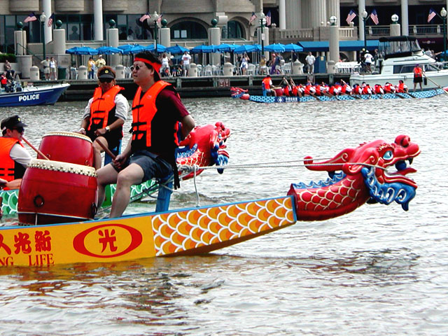
This photo is a contradiction intself to the rule of framing. You put the person on the left third because he's moving to the right which was good, but he's backwards so it looks bad. The positioning of it just makes it seem like the dragon head is more your subject than the people. A broader shot of the boat with the people rowing probably would have been better.
I love the colors in this picture, especially the blue umbrellas against the gray building. If there had been some way to not have the police boat and other boat in there, that would've been nice, but that is obviously not in your control
Hey!! I think I recognize this......... Is this D.C.? You caught some great colors here. I like how the blue in the dragon's head is matched by the parasols of the eatery on shore.
Cool shot! Life vests are a bit over bright. One whole boat might have been nice to see, or the race in progress, no downgrade, just commenting. Photo 9 Creativity 8 People 8 total 8
I think an angle just a little closer down to the water would have made this shot much more exciting and made the off-centeredness seem very intentional. The current angle almost puts you in a documentary-style mood.
Did we meet there? I was also at the race taking pictures for the challenge, but then decided I didn't like any of them well enough to enter. You seem to have got a little closer than me - good. For this challenge, I would've liked it better if my eyes were drawn more to the drummers, instead they keep on wandering to the dragon. I do like having the other boat in the background.
People, lots of them. Great colors. Back ground is a bit busy and takes away from the focus of the dragon boat. Still this is nice and I like it. Good work.







 Add photograph to your favorites
 Add photographer to your favorites


 Photographer found comment helpful.


