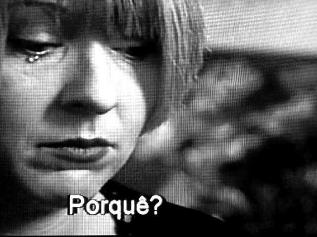
Damn... I was going to shoot my TV for this week. Good stuff here, and the subtitle is a nice addition. Could be interpreted as breaking the "artwork may not constitute the whole of the image" rule, but balls to that.
I'm going with the texture is supposed to be in this. That and the text just don't do "it" for me. The tear placement combined with the texture makes it appear that it's more of a growth or something and less tear like. I like the coloring and the lighting, but it's that damn texture I think that makes it look so 'hard', sorry.
Even though this is a picture of a movie screen (for this challenge, I think one of live people, well you know what I mean, would be better), it is very nice. The graininess of the screen adds to it. Also like the subtilte - "Why?" I think...that's what it is in French anyway.
Even though I speak Spanish, this picture would have had a stronger impact for me without the word. It would probably be even truer for people who don't know what it means.
Emotive. B & W works well. I don't know if it was meant to look Grainy, but I really think it works. I like it because it speaks to me, There is a message. Well done.






 Add photograph to your favorites
 Add photographer to your favorites


