wasn't sure what I'd get shooting into the sun, but I kind of like the flare. Technically it isn't very sound, but I like the outcome. I know it's pretty over-exposed, but it feels good; take pix of what you like to look at, right?
To each his/her own I guess.
Statistics
Place: 232 out of 313 Avg (all users): 4.6525 Avg (commenters): 6.1111 Avg (participants): 4.4837 Avg (non-participants): 4.9639 Views since voting: 1873 Votes: 236 Comments: 20 Favorites: 1 (view)
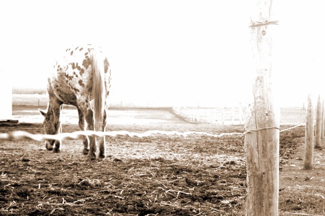
If that wire in front of the horse didn't play such a prominent part of this photo I would be apt to rate it quite a bit higher but unfortunately its very distracting. I like the high-keyness of the photo and the old look to it.
I'm sure the upper half glared out was on purpose, but honestly, I don't like it. I kinda feel it adds to the "artsy"-ness, but not as a photo (does that make sense).
6 Rob the Swash
The foreground is exposed nicely but the background is way overexposed and takes up more than half the picture. If this was done to get the horse nicely exposed then the image could possibly be improved by including more ground and less sky and use spot metering on the horse.
Perhaps sepia wasn't the best choice here - the top end of the photo feels too 'whited-out' to me. Nice choice to shoot over the wire though, the fence adds a nice line to the shot.
The composition is good, I like the perspective you have chosen. The sepia toning is also fitting. I find it is just blown out too much at the top right. I guess you wanted to have this effect right?
Very nice artistic effect. In my opinion, I would have preferred if the far right side were less washed-out... it draws my attention away from the horse. Also, the edge of the building on the left probably should have been cropped out.





 Add photograph to your favorites
 Add photographer to your favorites


 Photographer found comment helpful.


