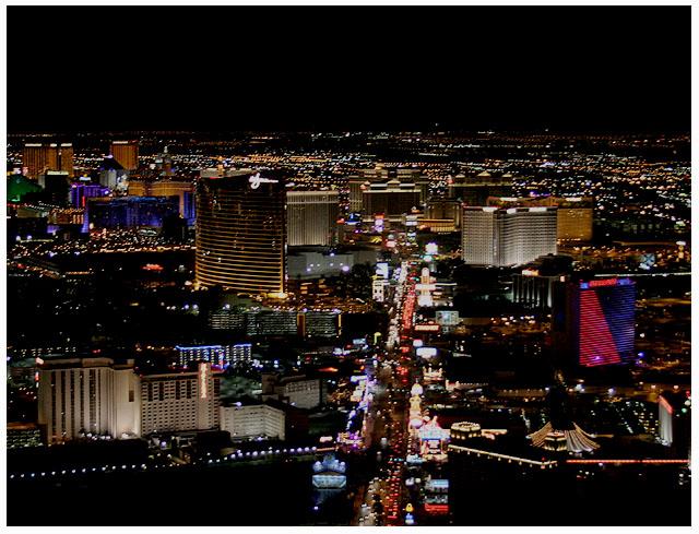
Fits the darkness theme. The general quality of clarity of the image are the strength of this picture. Composition is OK and you have a level horizon.
Compositionally the dark patch below the line of lights at the bottom of the frame seems empty and unneeded. You might consider cropping that out of the composition.







 Add photograph to your favorites
 Add photographer to your favorites


 Photographer found comment helpful.


