UPDATE
I really wanted to clone out the imperfections on the side. In fact, I did at first, and then remembered it was a basic editing challenge! :) Thanks for all the great comments, and this is my highest score yet!
Statistics
Place: 63 out of 373 Avg (all users): 5.6913 Avg (commenters): 7.3636 Avg (participants): 5.7302 Avg (non-participants): 5.6649 Views since voting: 1386 Views during voting: 457 Votes: 311 Comments: 13 Favorites: 1 (view)
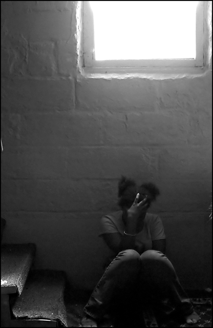
This composition has a very powerful, artistic feel to it. While it won't appeal to all, the DPC's best genuine artists like JPR & Goodman & Xion (and others) will probably rate it very highly. I have more modest artistic credentials, but I agree with what I hope they will say about it! 9
What better theme for a darkness challenge than an image of despair and hopelessness? Well done B&W. Including the bright window is perfect contrast to your subject's despair. That gives the feeling she has given up on life.
This may have been intentional but the focal plan is in front of your model and on her legs rather than her face. Focusing on the face would be worth consideration. There are two tiny items, one on the far laft side of the screen and the other on the far right. Since the viewer cannot tell what they are they act as a distraction and probably should be removed from the composition through a framing change or cloning.
I bet youre getting a fair bit of flack for the glarefrom the window? I think it adds to the emotion of the image - lightness outside, darkness within. Just as we often put on a brave face for the world outside, when we are torn appart within.
IMO cropping to just above the window sill would have dramatically improved this shot. In all other aspects this is great but the brightness from the window is really distracting.





 Add photograph to your favorites
 Add photographer to your favorites

 Photographer found comment helpful.


