Author Thread Comments Made During the Challenge
Post actions
Love this shot
Post actions
really very nice and simple!
Post actions
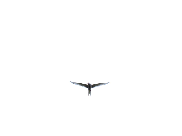
Way too far away. Other than the wings, I have nothing else to tell me what it is. Too much white as well.
Post actions
Too much sky and not enough bird. My thoughts.
Post actions
Nice shot. Too much white space and not enough bird detail for me
Post actions
Post actions
great use of negative space.
Post actions
simple but aesthetically pleasing 10
Post actions
wow, i love the simplicity, and how you still managed to keep the bird's details when it's flying over such an overcast/bright sky.
Post actions
Post actions
very simple and beautiful.i'm loving it.
Post actions
so simple yet so beautiful
Post actions
Post actions
Post actions
I like the use of negative space, but would have preferred to see the bird better. I like the position the bird is in with it's wings spread.
Post actions
This is very effective but I still want to zoom in. . . .
Post actions
There's too much negative space here. If the background weren't blown out I'd find this image more interesting. It looks like the crop is slightly off center, which I find distracting.






 Add photograph to your favorites
 Add photographer to your favorites


 Photographer found comment helpful.